Apple recently unveiled iOS 7 and it has the design community buzzing – in fact there will be hundreds of articles on the topic by the time I have completed mine. So, what’s all the fuss about? We are accustomed to and expect to see fluctuations in design trends. Well, the latest iteration of their mobile interface appears to represent a bold shift from a skeuomorphic based design space to a flat Windows “Metro” look.
Is this just the case of a company catching up to a competitor and staying fashionable or should we take this as a significant design event? And What the heck is skeuomorphism? READ ON!
Flat VS Skeuomorphic
skeuomorph – noun – an ornament or design on an object copied from a form of the object when made from another material or by other techniques, as an imitation metal rivet mark found on handles of prehistoric pottery.
Apple has pulled the plug on the skeuomorphic look of its mobile apps. Skeuomorphism attempts to mimic real world objects, for example the the bookshelf in the “Newsstand” app or the familiar yellowed-lined paper interface of their “Notes” app. This approach was initiated by Apple visionary Steve Jobs. His humanistic approach was to create an emotional connection between man and machine in the name of simplicity. In this context we can agree that skeuomorphism is more than just adding some lickable eyecandy to the mix, in fact it was introduced as a strategic attempt to mitigate the potentially steep learning curve for an entirely new device – the iPhone. The fancy drop shadows, gradients and overdone realism offered a successful way to invite the public to interact with a completely new interface. Skeuomorphism tries to teach by analogy.
Fast Forward to 2013
Along comes British designer and Apple senior vice president Jony Ives, who introduces a complete re-imagining of the aesthetic that has become synonymous with Apple. Perhaps this shift indicates that we have matured as digital devices users. iOS 7 definitely embodies the clean “less is more” ethos associated with flat, toned down minimalism. Surprisingly, though, it was Microsoft who really pioneered flat design with their latest operating system. Internally referred to as “Metro”, the Microsoft design team took its inspiration from the Swiss design movement and the design language signs found at public transport systems. The emphasis is placed on typography and quick minimalism as opposed to “story-telling” iconography.

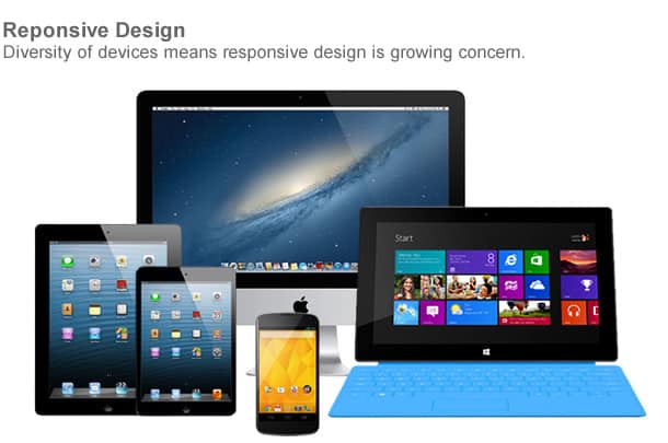
The kind of interface “decluttering” that flat design ushers in helps to bind form and function more tightly, discarding the chrome in order to give content the spotlight. Giving prominence to content and bringing order to complexity helps to make the interface FEEL natural instead of simply LOOKING natural. Another virtue of flat design is that it has the potential as an eloquent solution in response to the ever-growing diversity of devices. Ornamental and visually complex interfaces can become difficult challenges when they need to be seen on a myriad of mobile devices, tablets, desktops and at varying screen resolutions. These days doing more with less has never been more important.

Why Should We Care?
Designers pay close attention to trends set by industry trailblazers like Apple, Google and Microsoft because these players tend to set the tone for our shared aesthetic digital landscape and wield tremendous influence on establishing community binding conventions (for better or for worse).
This clip from the film “The Devil Wears Prada” helps to illustrate the kind of influence key decision makers can have on an entire industry. The trajectories set by these taste defining Behemoths are rarely arbitrary.
[youtube]http://www.youtube.com/watch?v=p5WWy_0VLS4[/youtube]
The Take Away
The root of discussion that this design shift has opened up should not make design folks pick sides or admit they backed the wrong horse but rather it simply reaffirms that the primary goal of design is to solve problems.
Good design is above all about meeting pre-defined objectives and making sure the problem solving is balanced. Simplifying interface is a virtuous endeavour but could be disastrous if done in a way that alienates the tastes and expectations of a target audience. Design is definitely not an arbitrary pursuit to make things pretty or simply about knowing what’s “IN”. Instead it is an exercise in trying to determine how goals can be accomplished most effectively and in a manner that will resonate with an intended audience. So whatever approach is taken be it, skeuomorphic, flat or some new trend, it needs to be justified by the ends. Are Apple fans ready for the new look? Time will tell if Apple’s new flat aesthetic will fall FLAT with its customer base.

Get Started Today
Start getting the online leads your quality business deserves today. Get a free no-obligation initial 30 minute consultation from one of our Google Certified Experts.
An EnvisionUP expert will respond within one business day or less with the next steps.