So you want a shiny new infographic to impress your audience? That’s a great decision, as they’re both popular and effective. In this post I’ll be sharing the five essential elements to making your infographic a success.
The critical thing to keep in mind is that there’s more to an effective infographic than pretty pictures. Design is about communication, and that means you have some planning to do before you even talk to your graphic or web designer. That conversation shouldn’t happen until you have the first 3 components in our list below completed.
What Is An Infographic?
Before we begin, it’s important to understand what you’re creating. An infographic (or information graphic) is a visual representation of data presented in an easy to understand and fun to read format. In the case of interactive infographics, they should also be easy to use. Infographics simplify complex information and make it easier for the average person to digest. They’re great for all business types – even “boring” ones and a very useful Digital Marketing tactic.
Aside from being trendy, they are a great way to communicate to your audience and even win them over.
Let’s start looking at the five elements.
1. The Story
The purpose behind an infographic is to tell a story. Without a story, an infographic is just a graphic. Ask yourself:
- What is the story I want to tell?
- Is it relevant to my organization?
- Why am I telling this story?
- Who am I telling this story to?
Remember, every story is different! A charity marketing infographic will have a different buyer’s journey than B2B digital marketing inforgraphic.
2. Data
The most important component of an infographic is accurate data. Think back to high school when you had to write a report and source all your references – and they had to be credible. Well, an infographic is sort of like a high school report. You need to ensure your data is accurate and that means using credible sources.
As an organization, you may already have data you can use, you just need to find it and sort it. Wherever the data comes from, you need to make sure it is credited somewhere on the infographic. Uncredited information is not only unethical, but is untrustworthy to most readers.
Don’t forget that the data has to tell a story. For an infographic we did for a Local SEO client, Husky Air (requiring Home Services digital marketing), we showed the math proving home owners can save over $3500 over 15 years by upgrading to a high efficiency furnace.

3. Copy
Once your data has been sourced and is nicely organized, it’s time to write copy. I know, this is an infographic, but you still need snippets of copy to provide context to the data and to tie the overall story together.
Write a gripping headline. With all that data, an infographic can get quite long and complex, and the headline is the key to engaging your audience. It will be part of tweets, posts, and pins, so keep it short yet descriptive. Don’t get caught up in making it clever; keep it simple. Focus on delivering your story to your audience.
Here are some examples of great use of copy in infographics:

Examples sourced from: Business Insider, NHLBI, and Visual.ly
4. Design
The design of an infographic should be based on the story. For example, if your infographic is about nature, then it should include design elements and colours from nature.
Colours
Keep your colour scheme to a maximum of three colours. Too many colours can make your infographic confusing.
Fonts
Use appropriate fonts. Before selecting a font, make sure it is legible in both large text and small text – especially when using numbers. Choose a maximum of two fonts. Allow for various size headlines to break up the data. Organize the data visually to guide your audience from beginning to end.
Again, keep it simple, don’t let the design overpower the story and data. The key to achieving a successful design is balance between data, copy, design elements and colours.
Here are some examples of design elements used in infographics:

Examples sourced from: NHLBI, Infographicality, and Business Insider
5. Graphs and Charts
Graphs and charts in an infographic are not your basic Excel bar graphs and pie charts. They are graphs and charts that display the data in a unique and creative way – this is where the designer will shine.
The type of graph or chart used depends on the data and the story. For example, when displaying data about people, consider showing human silhouettes in a chart. When appropriate, replace numbers with graphical elements.
Don’t overload your infographic with graphs and charts. To tell your story, you need a balance of graphs, charts and design.
Here are some examples of graphs and charts in infographics:
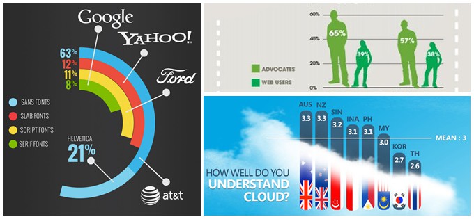
Examples sourced from: Visual.ly, and CloudTweaks
By keeping these five key elements in mind, you should be well on your way to creating an infographic that attracts your readers and makes your point successfully. As you go on your journey to bringing your information to life, keep in mind how each of these key components brings value to the end result.
Remember: keep it simple, focus on the story and use accurate data.

Get Started Today
Start getting the online leads your quality business deserves today. Get a free no-obligation initial 30 minute consultation from one of our Google Certified Experts.
An EnvisionUP expert will respond within one business day or less with the next steps.